Berkeley Fiction Review
Website Redesign
Role —
Web Designer
Team —
Berkeley Fiction Review
Duration —
May 2020 to August 2020
Overview —
During the summer of 2020, I was approached by a friend of mine in the Berkeley Fiction Review, to help redesign their Wordpress site. I took on the task of modernizing their overall aesthetic, streamlining the website's navigation, and helping promote their newly revived online blog.
Overview
The Berkeley Fiction Review is a UC Berkeley undergraduate, student-run publication.
Founded in 1981, the Berkeley Fiction Review is UC Berkeley’s oldest
prose journal, having emerged as a descendant of Berkeley's Occident
literary journal (1881 - 1960).
As a designer, I led the ideation, prototyping, and implementation
for their updated Wordpress website. I worked closely with the
managing editors at the time to quickly garner feedback and iterate from
their comments.
The Problem
BFR's old website design made it difficult to navigate and order past issues, while also providing an obstacle for the team in reviving their online blog presence.
In my initial conversations with the managing editors, we established 5 objectives to focus on with this website redesign:
(1) An overall redesign in aesthetics
(2) A cleaner, intuitive navigation
(3) More professional layout for blogposts
(4) Easier navigation of past/archived issues
(5) A "heavy overhaul in dragging [BFR] to the 21st century"
Goal
Modernize the BFR online brand, while making sure that the site is easy to modify for future website managers of all technical skill levels.
Research
I explored other literary magazines to see how they juggle their own online marketplace, blogs, and print publications.
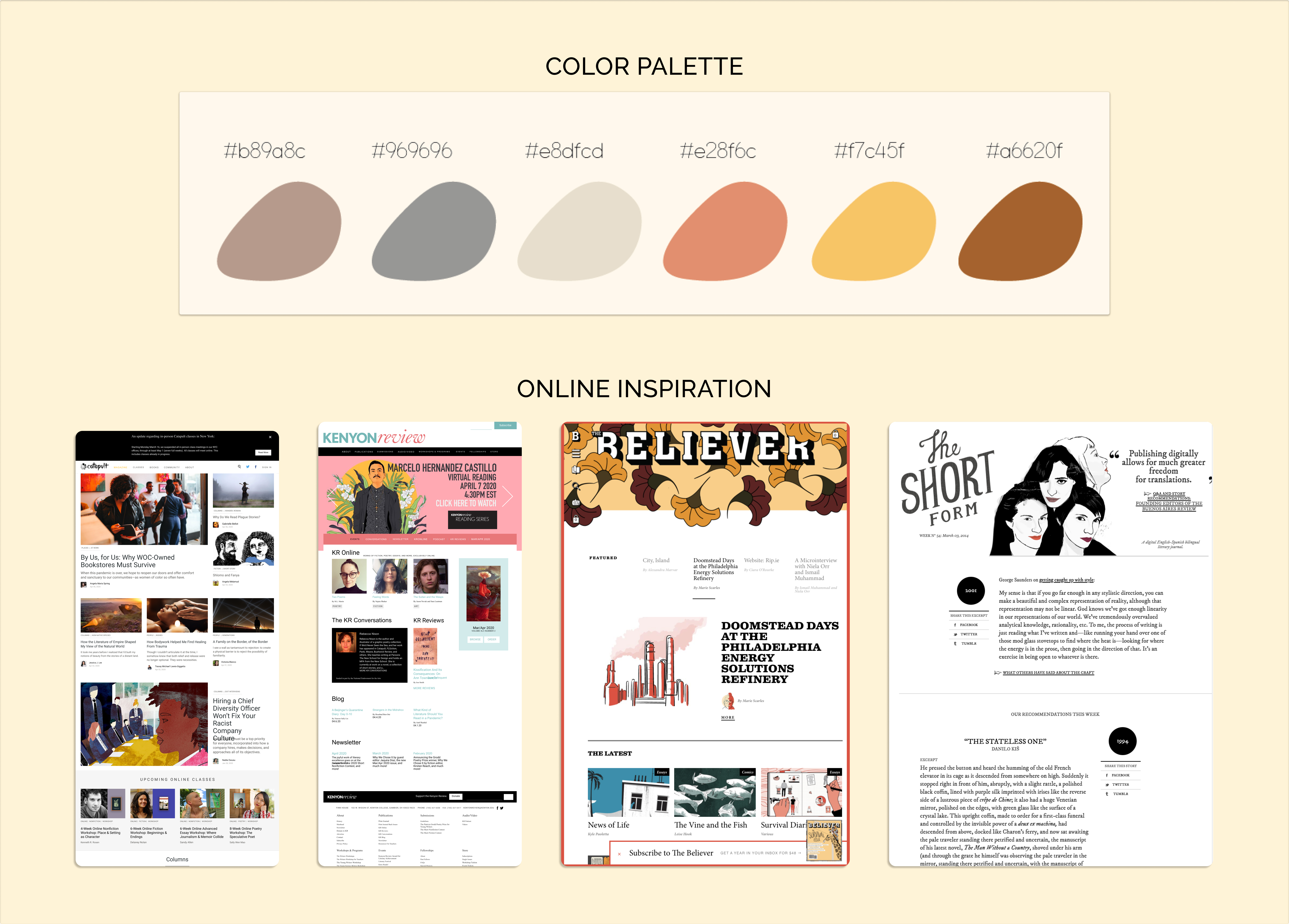
The BFR team sent over inspiration from other literary publications to point out
functionalities, interfaces, and interactions that they wanted to see reflected
in their updated side. Some major aspects I noticed across the team's requests and
inspiration were: (1) A simplified navigation bar at the top of the page,
(2) a large splash page that highlighted a publication or story of choice,
and (3) a flow that would direct traffic through home page content
rather than depending solely on the navigation bar.
In addition to simplifying the process of updating the website, I
wanted to make sure that the team would need to do little to no
maintenance work on top of their regular posting activity.
Redesigning the Website
Simplifying the Berkeley Fiction Review website while creating an active online presence.
Something I constantly kept in mind throughout the redesign
process was how to add and highlight new blog content without
overshadowing their large amount of existing online content.
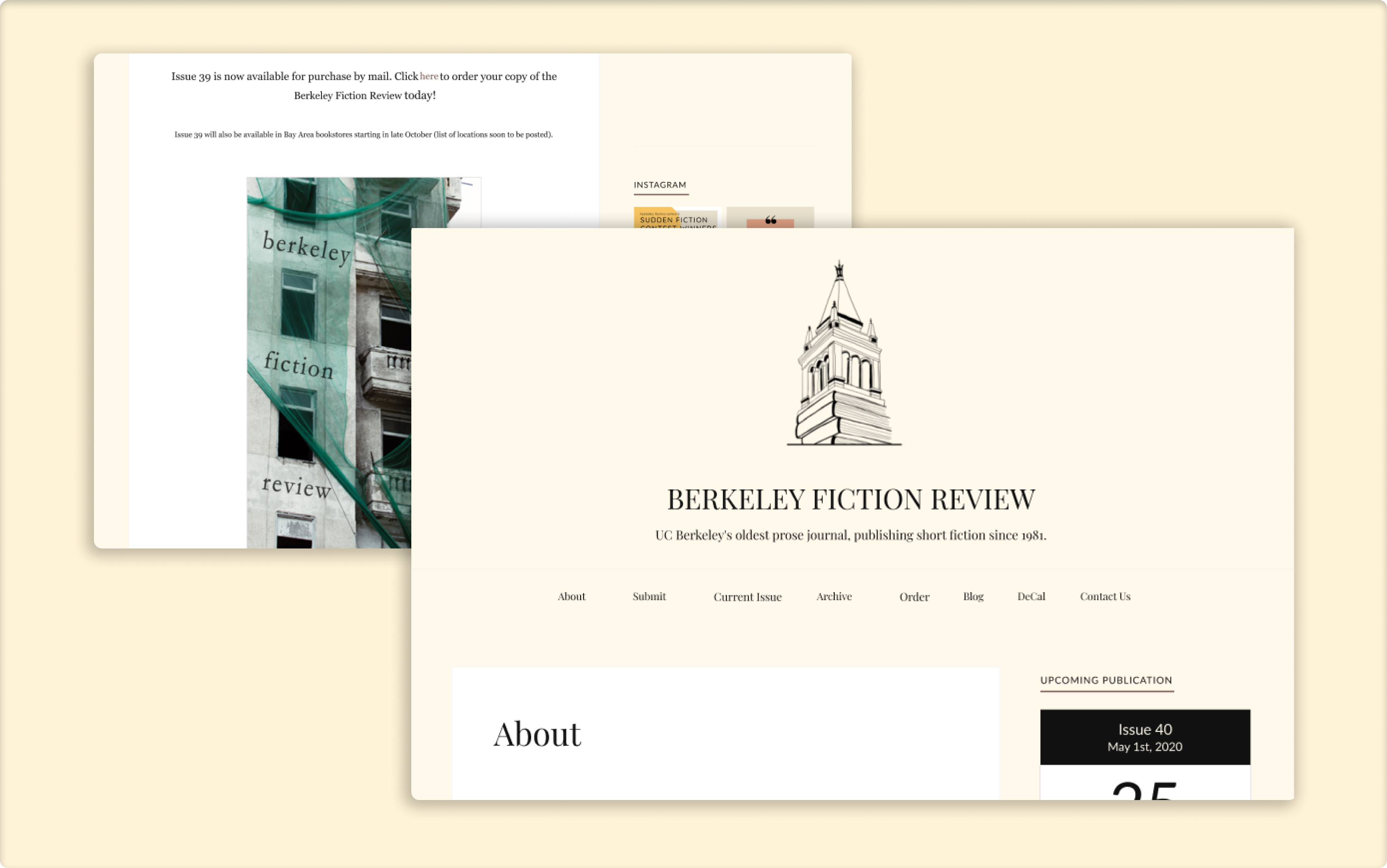
The old site had over 40 total navigation items embedded within
their menu, and the existing front-page content acted more as an
"About" page. It didn't give users According to the team, this resulted in users often
bouncing from the site.
Below are snippets from the original home page for reference:
We first tackled the menu bar, which included an information architecture
overhaul to simplify the navigation for users. In addition to the navigation
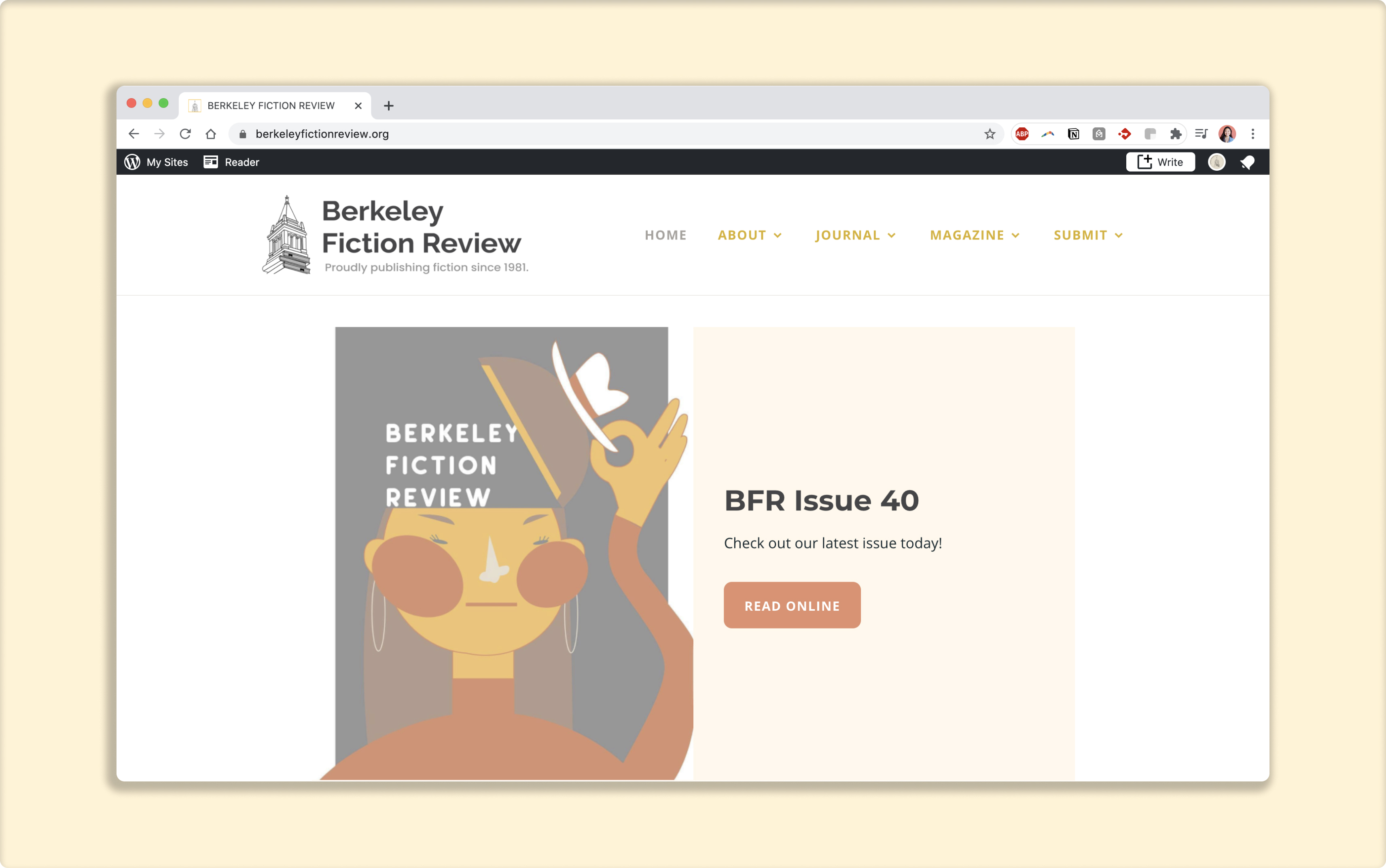
revamp, we decided to highlight the newest issue at the front of the
landing plage in order garner interest in the print publication and provide
users with an action. With our newest major announcements on the landing page,
we felt it would help BFR's online presence appear more active, with continuously
updated content at the front of their page.
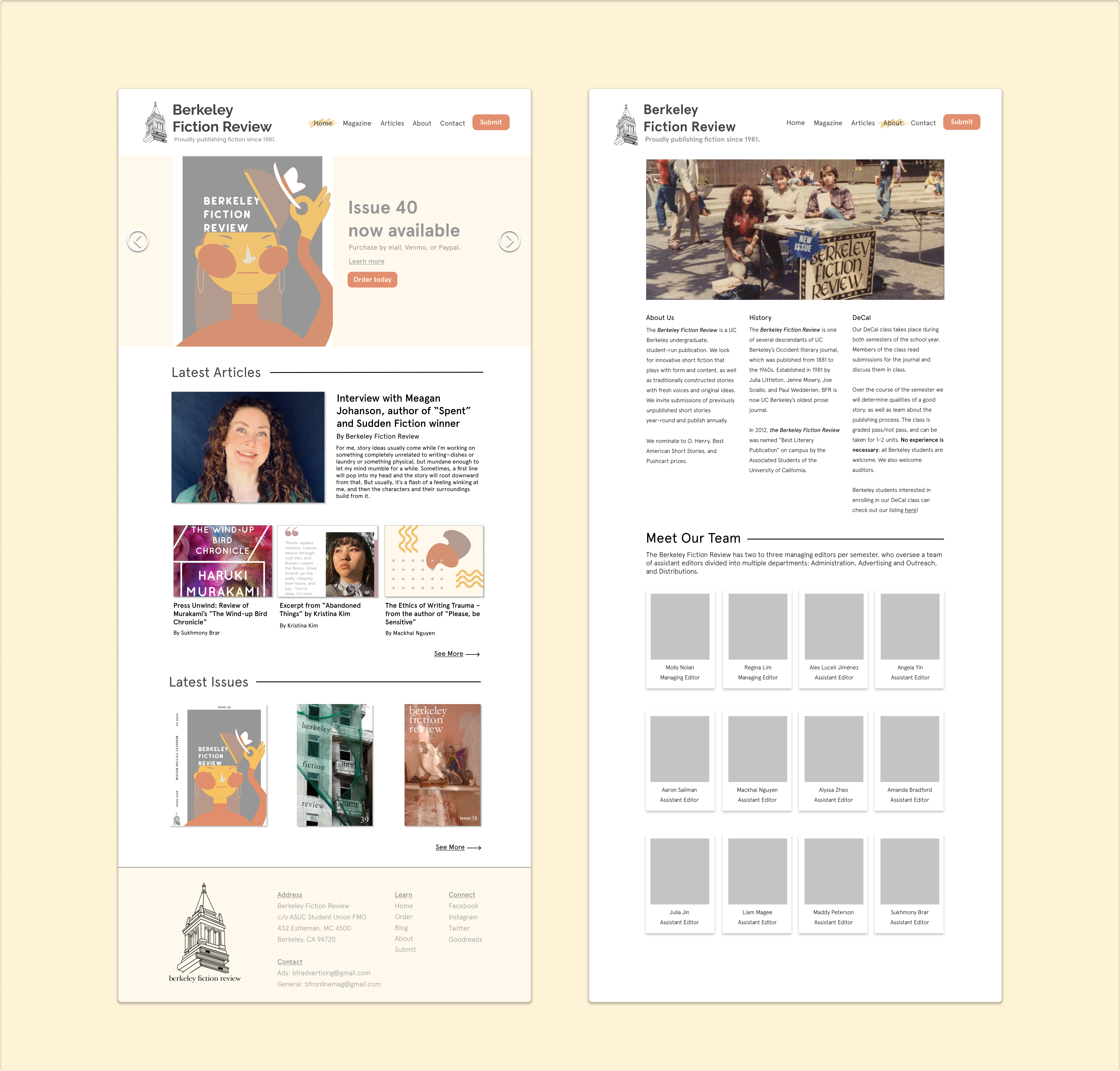
Below, you can check out the two-page mockup I created and presented to
the team midway through our prototyping process:
Obstacles
A small hiccup we experienced along the way and how we overcame it.
As I finished the first bits of my mockup, I wanted to get started on
implementation to work with our set timeline. This was when we realized
that we were pretty limited in what we could actually implement
on the site since it was hosted on the free version of Wordpress.
It wasn't my place to mandate that the team subscribes to a paid tier
for the sake of adding every part of my design, so we chose to trade off
certain aesthetic elements of the interface to prioritize the user
experience and work within the bounds of the tools we had.
At the end of the project, I feel we were able to still embody
the overall vision of the new site!
Key Takeaways
Design work involves a whole lot more than just designing.
Given this was my first time working in a major design project, I appreciated
the amount of trust that the BFR team put in not only my vision but also my
skills. I was familiar with how to use Figma for my personal use before, but
I had never had to think as deeply about the user experience, from both the
readers' and publishers' perspective, while creating my mockups. I found myself
having to juggle
questions such as:
✅ Where do we want to direct our users to most for our landing page call to action?
✅ What content belongs in a footer menu as opposed to top-level navigation?
✅ How can we par down the amount of information on each page?
While there definitely are design choice I would have made differently in hindsight,
I'm super grateful that I had this opportunity to not only gain experience in designing a
new internface but also to help bring greater online visibility
to the work that the Berkeley Fiction Review creates.
Special thanks to Regina Lim, Molly Nolan, and Alex Luceli Jimneez for working
with me throughout the summer, providing me with constant feedback, and trusting
me with such a huge job! Also wanted to shoutout Maddy Peterson for
connecting me with the team. 🫶